Bold Wedding Colors: Why Couples Are Ditching Safe Neutrals
Just a few years ago, a typical wedding almost automatically meant white tablecloths, cream stationery, and delicate floral arrangements in pastel shades of beige and blush pink. This aesthetic conservatism made sense—a neutral color palette was safe, easy to coordinate, and hard to criticize. But something fundamental has changed. Season after season, there is a clear shift: couples are reaching for colors that were recently considered "too risky" for a wedding. Burgundy, cobalt blue, deep lavender, emerald green, terracotta—these shades are no longer exceptions; they have become a prominent trend that has firmly rooted itself in the modern wedding scene. Why the shift? What is behind this newfound color confidence, and how can you express it in every wedding detail—from the venue and florals to the wedding invitations and stationery? This article has the answers.

Kraft No. 9 Wedding Invitation – Pink with Linen Belly Band

Wedding Invitation Perełki No. 1 – Minimalist Style with Half-Pearl Appliqué

Botanical Wedding Invitation Impresja No. 4 – Blue Hydrangeas
The End of the Beige Era – What’s Driving the Wedding Color Revolution
Personalization Over Playing It Safe
For years, weddings followed an unwritten script. A white dress, cream and beige as the primary colors, subtle pastel florals—the whole setup gave the impression of a "refined" event because it fit a universally accepted norm. The issue wasn't a lack of good taste, but a lack of expression. As couples began to move away en masse from cookie-cutter wedding templates and dive deeper into crafting their own unique stories, the color palette naturally stopped being a neutral background and became a key storytelling tool. A wedding is no longer just a show for the guests; it’s an autobiographical expression of the couple's character and values—and the colors had to follow suit.
Personalization has become the dominant trend in wedding planning across the globe. Couples want every element of their celebration—from the wedding menu and the first dance choreography to the typography on their invitations—to reflect their own aesthetic, not a cliché pulled from a decorator's catalog. In this context, choosing a bold color becomes an act of courage and authenticity. Instead of asking, "What will look pretty?" couples are asking, "What says something about us?" And the answer to that question is rarely "beige."
The era of social media also plays a crucial role here, having radically shifted aesthetic standards and expectations. Instagram, Pinterest, and TikTok flood brides- and grooms-to-be with images of weddings from all over the world—events full of color, contrast, and visual bravery. What seemed reserved for avant-garde editorials a few years ago is now within reach for every couple planning their big day. Seeing burgundy paired with rose gold at a wedding in Milan, or cobalt with ecru at a celebration in Barcelona, couples are increasingly bold in adopting similar ideas and adapting them to their own visions.
A Generational Shift – Millennials and Gen Z at the Altar
It’s no coincidence that in recent years, more and more weddings are being planned by Millennials and Gen Z—generations raised on the cult of authenticity, individualism, and aesthetic awareness. This is a demographic that chooses brands based on values, customizes their interiors to their exact liking, and rejects ready-made templates in favor of their own narrative. For these couples, beige and cream are associated with mediocrity, with a wedding "just like everyone else's"—and the last thing they want is an event that guests will forget a week after the ceremony.
Gen Z, in particular, strongly identifies with color as a tool for expressing identity. Studies show that for younger generations, aesthetics are inextricably linked to a sense of self-worth and authenticity. Choosing a deep sapphire over beige isn't a whim; it's a conscious declaration: "We know what we want, and we aren't afraid to show it." This attitude is permeating wedding planning with incredible force, changing the face of the entire wedding industry.
Moreover, expectations regarding the aesthetic of the ceremony itself are shifting. In the past, a wedding was primarily a party for the guests—the hosts were expected to provide good food, fun, and comfort. Today, couples increasingly treat their wedding as a curated experience—something meant to evoke emotion, tell a story, and leave a lasting impression. In this context, colors are a visual language that the couple uses to speak to every guest from the moment they receive the invitation. A cohesive, bold color palette turns a wedding into an aesthetic journey rather than just a logistical event.

Glamour Wedding Place Cards with Pearls – Pearls No. 1 White

Rose Bow Wedding Place Cards No. 1 – Pink Satin Glass Ribbon Cards

Impresja No. 8 Wedding Place Cards – Misty Forest Woodland Table Cards
The Pandemic as a Turning Point in Wedding Planning
Though it might seem surprising, the COVID-19 pandemic and its associated restrictions on events had a massive impact on how couples think about what they truly want from their big day. When ceremonies had to be scaled down to intimate gatherings and planning was delayed month after month, many couples gained time to reflect—and discovered they wanted something entirely different from a typical, traditional wedding. Upon returning to normalcy, a significant portion of couples entered the planning phase with a clear vision: the wedding must be real, ours, and expressive. The departure from beige became a symbol of a new beginning—the courage to realize dreams without compromise.
This is especially visible in the context of decor and stationery choices. Couples who sat with laptops on their knees for a year or two, browsing thousands of inspirations from around the world, returned to florists and decorators with fully formed, concrete visions. They stopped asking, "What would be appropriate?" and started asking, "How do we make what we dreamed of happen?" This shift in client mindset completely rebuilt the relationship between couples and the wedding industry.
Color Psychology – What Your Palette Says About You
Color as an Emotional Message
Colors at a wedding aren't just about aesthetics—they are a deeply coded emotional message that reaches every guest before they even step into the venue. Color psychology provides compelling evidence that the shades a couple chooses say a lot about their values, character, and the atmosphere they want to create during their celebration. Therefore, the transition from beige to bold colors is read just as much as a shift in mentality as a shift in aesthetics.
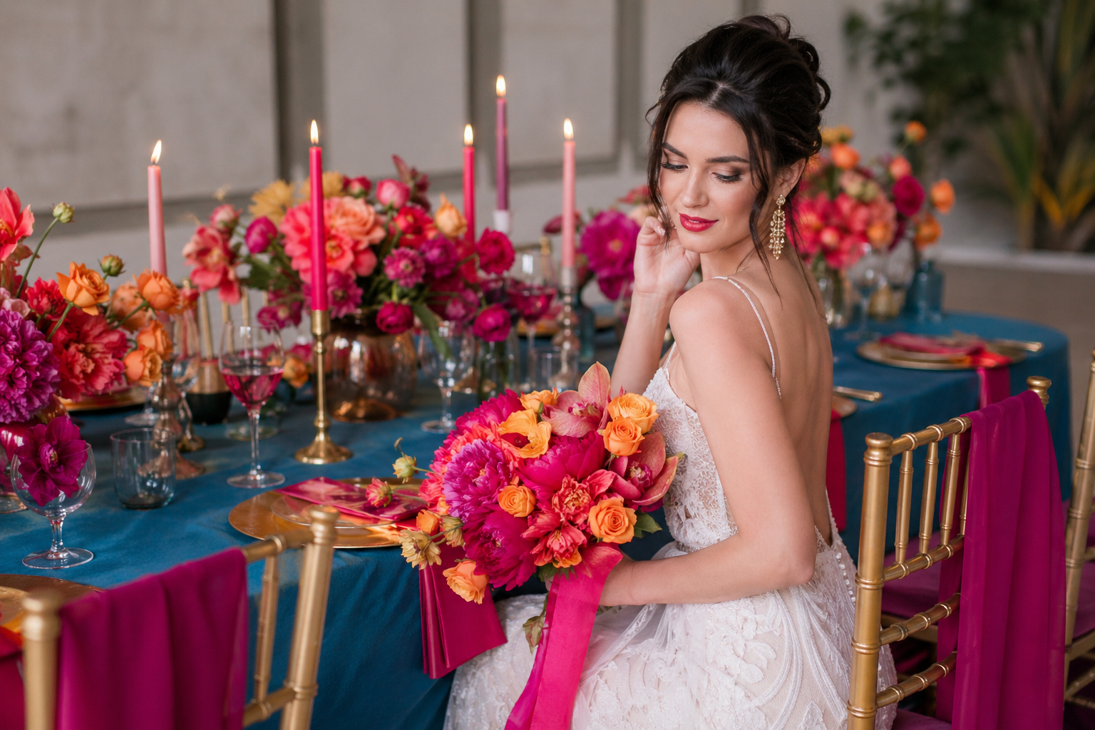
Beige and cream have long been associated with safety, neutrality, and classic elegance. These are colors that offend no one, but they also don't particularly engage anyone emotionally. Burgundy, on the other hand, evokes associations with passion, depth, and luxury—it’s a color that says, "This wedding is exceptional and full of emotion." Cobalt blue communicates confidence, sophistication, and innovation. Emerald green brings to mind harmony with nature, vitality, and balance. Each of these choices is simultaneously an aesthetic and psychological declaration, which is exactly why more and more couples are making them consciously.
It’s no wonder that wedding florists and decorators increasingly start consultations not by asking about the venue's style, but by asking about emotions—what feelings does the couple want to evoke in their guests? Should it be touching, exciting, intimate, joyful? The answers to these questions determine the color palette far more accurately than any catalog of the season's trendy colors. When a couple says, "We want guests to feel like they're in a fairy tale," we'll likely end up with deep lavender accented with silver—not beige and cream. And that is exactly the transformation happening in the wedding industry today.

Golden Fortune Cookies with Personalized Label | Affordable Wedding Favours | Cejla No. 3

Rubin No. 4 Wedding Scratch Cards – Gilded Eucalyptus & Wedding Favours

Soy Candle Rubin No. 9 – Gilded Roses and Wedding Favours
Color and Cohesion – From the Invitation to the Last Dance
One of the key principles of modern wedding planning is visual cohesion, which experts call the "red thread"—an aesthetic throughline that weaves through every element of the celebration, from the guest's first contact with the invitation to the final frame captured on the dance floor. A bold primary color demands exactly this kind of cohesion—and achieving it is much harder with a beige palette, which is so neutral that no one knows whether to pair it with gold, white, or vanilla.
When a couple chooses a bold color—say, burgundy—suddenly everything becomes simpler. Wedding invitations in a rich burgundy hue with rose gold accents send a clear signal to guests: this will be an elegant event full of depth. Place cards on the tables in the same color scheme emphasize that the couple has taken care of every detail. Bouquets in warm reds and pinks correspond with the overall palette. Everything speaks the same language, creating a setting that guests will never forget. This is exactly why choosing a bold color is simultaneously a choice for cohesion—because it requires thinking through every element and giving them a common denominator.
The rule of three colors—one dominant, one secondary, and one accent—is the key to successfully pulling off any bold palette. For example: cobalt blue (dominant) + cream (secondary) + silver (accent) is a combination that works beautifully for both glamour and coastal chic styles. Burgundy + rose gold + cream is the perfect palette for a romantic, autumnal vintage wedding. A cohesive three-color palette carried through all the stationery—invitations, menus, place cards, wedding favors—makes the wedding look like a curated masterpiece, rather than a random collection of decorations.
Top Bold Wedding Color Trends for 2025–2026
Burgundy – A Return to Roots with a Modern Twist
Burgundy is one of those colors that for years was associated either with 90s weddings or with bold proposals for couples who truly knew what they wanted. For a long time, it was too intense for the mainstream. But the 2025-2026 season has breathed new life into burgundy—and in a much more sophisticated iteration than we remember from the past. Today, burgundy isn't paired with heavy, over-the-top arrangements, but with subtle touches of rose gold, delicate florals in cream-blush tones, and stationery that radiates warmth and luxury.
What makes burgundy work so perfectly as a primary wedding color? Above all, its incredible depth—it’s a hue that looks different in daylight, different by candlelight, and different again in photographs. This versatility makes it a highly photogenic color, adding a sense of drama and elegance to wedding photos that you simply can't find in beige or pastels. Bouquets in shades of bordeaux and raspberry pink, wine-colored tablecloths, place cards with gold foil on a burgundy background—these are the setups gracing the most stylish weddings today, drawing awe on the profiles of top wedding decorators and photographers.
It’s also worth noting that burgundy works brilliantly across various wedding styles. In a glamour setting—paired with gold and crystals—it creates a palatial, lavish atmosphere. In a vintage theme—with seasonal blooms and antique details—it evokes the mood of old manors and elegant parlors. In a rustic style—with natural fabrics and wooden elements—it adds warmth and a homey feel. This versatility has made burgundy a color that almost any couple can adapt to their wedding vision, regardless of the venue or style of the celebration.

Flores No. 1 Soy Candle in Gypsum – Gilded Wedding Favour

Korani No. 3 Soy Candle – Eucalyptus Motif Wedding Favours

Flores No. 2 Soy Candle in Gypsum – Burgundy Flowers Wedding Favour
Cobalt Blue – The Epitome of Sophistication and Confidence
Just a few years ago, cobalt blue at a wedding might have been considered an extravagance. Today, it is synonymous with sophistication and aesthetic bravery—and for good reason, it appears in almost every ranking of the trendiest wedding colors for the 2025-2026 season. Cobalt is a color that photographs phenomenally—deep, saturated, eye-catching, yet never aggressive. Paired with ecru or cream, it creates a contrast that looks like it was pulled straight from a luxury fashion editorial.
Cobalt blue also carries incredible symbolism, making it particularly attractive for weddings. Blue has been the color of fidelity, peace, and trust for centuries—values that perfectly align with the symbolism of marriage. A "something blue" in the form of a dominant cobalt accent is a modern interpretation of an old tradition, retaining the symbolism but giving it a completely new, contemporary form. It’s no longer about a blue garter hidden under a dress, but about a bold aesthetic declaration expressed in every element of the celebration.
In practice, cobalt works exceptionally well as a stationery color—deep navy or cobalt as a background for invitations with white or silver printing is a combination that makes a phenomenal first impression on guests. Imagine: an envelope the color of a deep sky, and inside, an invitation with elegant silver typography—even before the wedding, it communicates that the couple knows exactly what they want. Wedding invitations in cobalt, matching place cards and menus, and wedding favors kept in the same palette—such cohesive stationery is now the standard for couples who take their color palette seriously.
Lavender and Deep Purple – Romance with Depth
Lavender and its deeper variations—lilac, violet, amethyst—are another family of colors boldly stepping into modern weddings. Lavender fits beautifully into the 2025-2026 trends, offering something between the subtlety of pastels and the vibrancy of saturated hues—it’s bold but not overwhelming, romantic but not juvenile. It’s a color that speaks particularly to couples looking for an alternative to blush pink—something equally delicate, but more original and less obvious.
Deep purple and amethyst, on the other hand, are colors that introduce a note of mystery and luxury to a wedding. Combined with gold or silver accents, they create arrangements with an almost magical vibe—a wedding in these hues feels like a fairy tale, like a night sky, like something truly unique and ethereal. Florally, purple is an incredibly rewarding color: lavender sprigs, orchids in lilac tones, clematis, lisianthus, delphinium—the possibilities are endless, and each creates bouquets that are impossible to ignore.
It’s also worth noting how lavender and purple perform in wedding stationery. Lavender invitations with subtle floral illustrations and gold calligraphy are one of the most popular choices among couples seeking a romantic, non-obvious style in the 2025 season. Such a set—lavender as the base color, adorned with details in gold or silver—works perfectly for both outdoor ceremonies and elegant ballroom receptions. It’s a color that demands confidence from the couple but rewards them tenfold, providing a setting unlike any other wedding their guests have attended.
Colorful Wedding Stationery – Your First Aesthetic Statement

Navy Blue No. 1 Wedding Place Cards – Satin Ribbon Name Tags with White Print
Rose Bow Wedding Place Cards No. 1 – Pink Satin Glass Ribbon Cards

Glamour Wedding Place Cards No. 1 – Satin Name Cards with White Print
The Invitation as the Wedding's Calling Card
A wedding invitation is much more than a card with a date and an address. It is the couple's first physical communication with the guest—the first encounter with the wedding's aesthetic, designed to convey the atmosphere, style, and emotions of the celebration in just a few seconds. And that is exactly why the decision to choose a bold stationery color is so important—it’s the moment the couple declares their aesthetic ambitions and sets the bar for the entire event's design.
When a couple chooses cobalt instead of cream, burgundy instead of blush pink, or emerald instead of a white background, the invitation instantly becomes something extraordinary—something the guest won't just toss aside after reading, but will display on their mantelpiece as a piece of art. The trend for colorful wedding stationery is growing rapidly, and the latest collections from wedding stationery designers clearly respond to this demand, offering designs in deep, saturated hues with elegant letterpress, spot UV finishes, and metallic foils.
At Amelia Wedding, you can find designs across a very broad color spectrum—from classic, elegant compositions to striking options for couples who aren't afraid of color. When choosing, it’s worth being guided not just by current trends, but primarily by what emotions the invitation should evoke in the guest—and whether it fits the overall vision of the wedding. Well-chosen stationery is an investment that pays off for years in photos and memories.
Place Cards, Menus, and Favors – A Cohesive Color Story
The invitation is the beginning, but the colorful story of the wedding doesn't end with mailing the cards. Every piece of stationery at the reception venue—place cards, menu cards, table numbers, welcome signs, thank-you notes—is a fragment of a larger whole that creates a cohesive visual narrative. When these elements are color-coordinated, the impact is incomparably stronger than a random assortment of neutral pieces from different collections.
Golden Fortune Cookies with Personalized Label | Affordable Wedding Favours | Cejla No. 3

Personalized Greenery Fortune Cookies | Original Wedding Favours | Cejla No. 5

Custom Text Fortune Cookies, Floral Design | Original Wedding Favours | Korani No. 2
Place cards are one of those stationery elements seen by every guest in a very intimate moment—when taking their seat at the table, when attention is focused on the details. A burgundy place card with the guest's name in gold script is a detail that says: "We took care of everything." A lavender place card with a subtle floral motif ties back to the bouquets and floral decor. This cohesion between the stationery and the venue decor is a key hallmark of a high-end wedding today—and more couples understand that a bold color requires this consistent execution across all elements.
Wedding favors are the final chord of the wedding's colorful symphony. When a guest receives a beautifully designed favor in the wedding's primary color—whether it’s a thank-you tag attached to a gift, a decorative envelope, or a personalized bookmark—they take a piece of that day's aesthetic home with them. It’s a gesture that concludes the story told by color and leaves the guest feeling they participated in something truly exceptional and thoughtful.
How to Match Colorful Stationery to Your Venue
Choosing a bold stationery color should be considered in the context of your wedding venue. A color that dazzles in an industrial loft might clash in a baroque palace—and vice versa. Therefore, before making a final decision, it’s worth considering a few key factors.
First—the vibe of the venue. Glamour-style interiors with gold details and crystal chandeliers will beautifully embrace cobalt, burgundy, or deep navy in the stationery—these colors will enhance the luxurious nature of the space. Conversely, rustic barns and natural interiors featuring wood and exposed brick harmonize best with terracotta, sage green, or mocha mousse—colors closer to nature.
Second—the season. Spring and summer favor blues, herbal greens, and light lavenders that mirror the surrounding nature. Autumn is the time for burgundy, terracotta, and warm browns. Winter opens the door to cobalts, navies, and deep purples enriched with silver and icy accents. Choosing the right color in the context of the season makes the wedding feel like a natural extension of the time of year—rather than an artificial element placed in contrast to its surroundings.
How to Implement a Bold Color Scheme Step by Step

Gold Wedding Seating Chart with Foliage – Ruskus No. 2

Rubin No. 5 Wedding Seating Plan – Purple Heather and Gold Motif

Modern Pink Wedding Seating Plan | PVC Acrylic Guest Board | Personalized Seating Chart | Kraft No. 9
Step 1 – Choose a Palette, Not Just One Color
The biggest mistake couples make when trying to introduce a bold color to their wedding is focusing on a single shade and trying to build the entire design exclusively around it. The result can be overwhelming, and instead of elegance, you get monotony or excess. The secret lies in building a harmonious palette of three colors: dominant, secondary, and accent—and consistently carrying this palette through all elements of the wedding, from decor to stationery.
Example palettes that work perfectly for 2025-2026 weddings:
| Dominant Color | Secondary Color | Accent | Ideal Wedding Style |
|---|---|---|---|
| Cobalt Blue | Cream / Ecru | Silver | Glamour, coastal chic |
| Burgundy | Rose Gold | Cream | Vintage glam, romantic |
| Lavender | Buttercream | Sage Green | Romantic, boho |
| Emerald Green | White | Gold | Glamour, garden party |
| Terracotta | Cream | Copper | Rustic, boho |
| Mocha Mousse | White | Gold | Modern classic, boho |
When building your color palette, it’s also helpful to use the 60-30-10 rule: the dominant color should take up about 60% of the visual space (tablecloths, backdrops), the secondary color—30% (flowers, drapes, details), and the accent—just 10% (place cards, foil stamping, metallic details). This proportion guarantees balance and elegance, no matter how intense the dominant color is.
Step 2 – Start with Your Wedding Stationery
Wedding stationery, primarily the invitations, should be the first element where the wedding's color palette materializes. This is an incredibly practical approach for several reasons. First, the invitation is sent out months before the wedding, giving you time to verify if the chosen color works in practice and if guests react to it the way you imagined. Second, once the stationery is designed, it serves as a physical reference point for all subsequent decisions—when choosing flowers, fabrics, and table settings.
Well-designed wedding stationery includes not just the invitations, but a full suite of materials: RSVP cards, details cards, envelopes, and later—for the reception—place cards, menus, table numbers, and favors. When all these elements are kept in the same color scheme and style, the wedding gains a monumental cohesiveness that cannot be achieved any other way. It is this cohesiveness that distinguishes weddings people talk about for years from those that fade from memory after a week.
Step 3 – Florals and Decor as an Extension of Your Palette
After finalizing the color palette and ordering the stationery, it’s time for the flowers and venue decor—the elements that visually dominate the space and have the biggest impact on the guests' first impression. The florist becomes the translator of your color palette here—their job is to translate the chosen hues into living, organic arrangements that breathe life into your color vision.
In spring and summer, colorful weddings are dominated by peonies in deep reds and pinks, dahlias in shades of burgundy and terracotta, lavender sprigs, and romantic ranunculus. In autumn, chrysanthemums, coneflowers, and decorative branches in gold, bordeaux, and warm browns work perfectly. Winter weddings in cobalt or graphite can rely on arrangements with white and blue flowers, supplemented by evergreen branches and decor featuring pinecones or frosted glass. A good florist is almost always able to find floral equivalents for your chosen palette—it’s just a matter of the season, timing, and clear communication during your consultation.
It’s also worth paying attention to fabrics and furniture—tablecloths, napkins, chairs, and armchairs. Renting velvet chairs in cobalt or burgundy is now standard among top-tier decor companies, and their presence in the room gives the design a luxurious, cohesive character. Pairing vibrant velvet with beige or cream tablecloths creates a visual tension that photographs brilliantly and feels aesthetically refined.
Common Fears About Colorful Weddings – And How to Overcome Them
Glamour Wedding Place Cards with Pearls – Pearls No. 1 White
Rose Bow Wedding Place Cards No. 1 – Pink Satin Glass Ribbon Cards
Impresja No. 8 Wedding Place Cards – Misty Forest Woodland Table Cards
"What if it looks cheap or tacky?"
This is probably the most common fear among couples opting for a bold primary color for the first time. The answer is simple: the difference between a sophisticated colorful wedding and a tacky one lies in the quality of materials, the cohesion of the palette, and proportions. An intense color executed in premium fabrics, with elegant stationery and carefully curated florals, always looks luxurious. What looks cheap isn't the color, but low-quality materials and a lack of aesthetic harmony—and these flaws would be just as visible in beige as they are in cobalt.
The key is maintaining proportions and color hierarchy—the aforementioned 60-30-10 rule. When the dominant color is strong (say, burgundy), the secondary elements (cream, ecru) should make up the majority of the space and let the design "breathe," giving the primary color room to shine without overwhelming the senses. Using a bold color as an accent, rather than completely filling the space with it, is the rule that preserves elegance and avoids a cluttered look. Experienced wedding designers know exactly how to strike this balance, and it’s worth trusting their expertise.
The quality of printing and paper in your stationery is also crucial. A wedding invitation in deep cobalt printed on thin, standard paper will look entirely different from the same invitation on thick, textured cardstock with spot UV finishes. Investing in high-quality stationery is an investment in your first impression—and in the context of a colorful wedding, it is especially worth not cutting corners here.
"Will guests know what to wear?"
Another concern involves the guests—especially when the wedding's color theme is strongly defined and the couple would like guest attire to harmonize with the overall palette. This is a matter of communication—and once again, stationery comes to the rescue. It is becoming increasingly popular to include dress code suggestions on the RSVP card or a separate details card, indicating a preferred color palette or requesting the avoidance of specific colors (e.g., white or black).
It’s also worth carefully considering the wording of the information provided to your loved ones. If you're wondering how to tactfully phrase requests to your invited guests, check out our article on what wording to use on wedding invitations to avoid any misunderstandings.
You can also take advantage of modern wedding planning tools. The free wedding app Blissaro allows couples to manage their guest list, dress code information, and many other logistical details in one place—making it much easier to communicate color preferences to guests without having to send hundreds of individual messages. Such tools are becoming the standard for couples planning weddings with a comprehensive aesthetic vision.
"Will a bold color look dated in 10 years?"
This is a fundamental question many couples ask themselves. Beige is often chosen because it seems "timeless"—but is it really? Wedding photos in beige and cream from 2015 look just as dated today as photos featuring burgundy from the 90s. No color is literally timeless—instead, every color tells the story of its era, and that is a feature, not a bug.
Furthermore, bold color schemes in wedding photography usually "age" much more beautifully than neutral ones. Deep cobalt or emerald green on film carries an intensity and mood that draws the eye for years. Color carries emotion—and emotion doesn't age. A couple who opens an album from their burgundy-and-gold wedding 20 years later will instantly feel exactly what they felt on their wedding day—because the color will recall the vibe, the temperature, and the emotions of that day far more effectively than a neutral cream and beige background ever could.
Wedding Color Trends for 2026 – What Will Dominate the Season?
Burgundy, Cobalt, and Mocha Mousse as the Trio of the Season
The 2026 wedding season brings a clear continuation and intensification of the bold color trends that have been building over the last two years. Burgundy, cobalt blue, and mocha mousse—this is the trio of colors that will dominate weddings in the upcoming season, making them stand out from previous years. Each of these colors has its own distinct character, but they all share one thing: they offer something far more interesting than neutral beige.
Burgundy entered the 2025 season with a bang and is gaining even more momentum for 2026—appearing in florals, textiles, stationery, and bridesmaid dresses, creating a rich, passionate setting that perfectly suits the atmosphere of romantic evening celebrations. Cobalt blue is gaining popularity at a pace no one would have expected a few years ago—transforming from a "risky" color into a synonym for elegance and confidence. Mocha Mousse, selected by Pantone as the color of the year for 2025, will continue to feature in wedding designs as a warm, elegant base for more striking accents.
It’s also worth keeping an eye on the rising colors of the 2026 season: chocolate brown and caramel are gaining traction as alternatives to classic beige—offering similar warmth, but with the depth and character that beige lacks. Terracotta maintains its popularity as a natural, organic hue, ideal for outdoor and boho weddings. And lavender is becoming a color hit for couples seeking a romantic alternative to blush pink—more original, yet equally delicate.
Color Hyper-Personalization – From Trends to Your Own Story
Wedding industry experts agree: 2026 brings an even stronger trend of hyper-personalization, where global color trends are merely a starting point, not a mandatory template. Couples are increasingly creating their own unique palettes—inspired by their hometowns, shared travels, beloved works of art, or even the colors they wore when they first met. It’s a fascinating phenomenon that makes every wedding authentically unique and unrepeatable.
In this context, the role of wedding stylists, decorators, and stationery designers is not so much to dictate trends, but to creatively support the couple in realizing their own vision. A good wedding stationery designer today acts a bit like a boutique publisher—taking the couple's raw idea and giving it a professional, aesthetically polished form. This is exactly the approach represented by Amelia Wedding—offering not just ready-made collections, but the possibility of personalization that allows every couple to create stationery truly tailored to their story.
For more information on upcoming industry news and styles, check out our dedicated post on wedding trends for 2025 and 2026.
When planning a wedding for 2026, it’s also wise to use modern tools that simplify managing all the logistics and guest communication. The free wedding app Blissaro is the perfect solution for couples with a detailed vision for their wedding who need a single hub to manage their guest list, seating chart, day-of timeline, and many other details. Modern wedding planning is the perfect blend of beautiful aesthetics and efficient organization.
Inspiration and Practical Advice from an Expert
Plan the Color from the First to the Last Detail
The true success of a colorful wedding lies in consistency. The primary color should be visible at every touchpoint of the celebration—from the invitation envelope, through the ceremony decor, to the reception florals, the wedding cake, and the thank-you cards guests take home. Carelessly executing the color across only a few elements results in a half-baked effect—instead of a cohesive story, you get a few chapters from different books.
Start with the wedding stationery—let it be the roadmap for all subsequent decisions. Order fabric swatches and compare them with the color samples from your invitations. Show your invitation design to your florist and let them draw inspiration from it when composing your bouquets. Show the stationery design to your venue decorator so they can select tablecloths, napkins, and table decor in harmonizing shades. This cascading method of planning—from stationery to all other elements—is a proven way to achieve absolute cohesion and reduce the risk of color clashes to a minimum.
Also, remember the details that are often overlooked during planning: the wedding cake should feature accents in your primary color (fondant, embellishments, flowers), the menu on the board or card should color-coordinate with the rest of the stationery, and even the ribbons on the guest favors should match your accent shade. Every detail reinforces the overall effect—and it is this meticulousness that ensures a boldly colored wedding is remembered for years.
Trust the Experts, But Stay True to Your Vision
The wedding industry is full of experts—stylists, decorators, florists, photographers. Everyone has their favorite colors, their experiences, and their views on "what works." These are valuable pools of knowledge worth tapping into—but never at the expense of your own vision and authenticity. Couples who blindly follow expert advice without emotional investment often end up with a beautiful but "empty" wedding—technically elegant, but devoid of soul.
Before you head to your first consultation with a decorator or florist, create your own mood board featuring colors that move you. Collect photos of weddings, interiors, clothing, landscapes—anything that aesthetically resonates with your sense of beauty. Show this board to the experts as a starting point for discussion. Your role is not to rubber-stamp the specialists' proposals, but to actively collaborate in creating something that is authentically yours.
And finally—the most important advice of all: do not be afraid of color. Beige is safe, but safe weddings are forgotten. Burgundy, cobalt, emerald, lavender—these are colors that carry emotion, create atmosphere, and tell a story. And the story of your wedding deserves colors as bold as your feelings. Take advantage of the extensive offerings at Amelia Wedding, where you will find stunning stationery and wedding accessories across a wide spectrum of colors—and start crafting your own bold color story today.
Szymon Jędrzejczak
Wedding stationery designer with years of experience in the wedding industry. Passionate about following the latest wedding trends, he helps engaged couples create the cohesive, aesthetically perfect setting they’ve always dreamed of for Amelia-Wedding.pl.
Recommended Articles
Szymon Jędrzejczak
Wedding industry expert and stationery designer at Amelia-Wedding.pl. For years, she has been helping couples create unforgettable moments by combining tradition with modern design.